
JLL Rebrand to Achieve Ambitions

Jones Lang LaSalle reintroduced itself to the world as simply JLL, launching a global rebrand that was as much about modern relevance as it was about visual clarity. The goal: create a brand identity that could scale across markets, perform across digital platforms, and reflect the company’s position as a forward-thinking leader in commercial real estate.
The legacy wordmark—long, formal, and complex—was replaced with a compact, confident acronym supported by a bold, contemporary logo mark. The new visual system moved away from dense, traditional corporate design toward a cleaner, more editorial canvas.
Global television commercial featured on Bloomberg television
Design expression was guided by minimalism and modernism: generous white space, a disciplined grid, and a simplified color palette rooted in red, black, and white. Typography shifted to a sans-serif system, chosen for its clarity and digital friendliness. Photography and iconography were recast to feel more authentic, people-first, and contextually grounded—bringing warmth and relevance to the brand’s global presence.
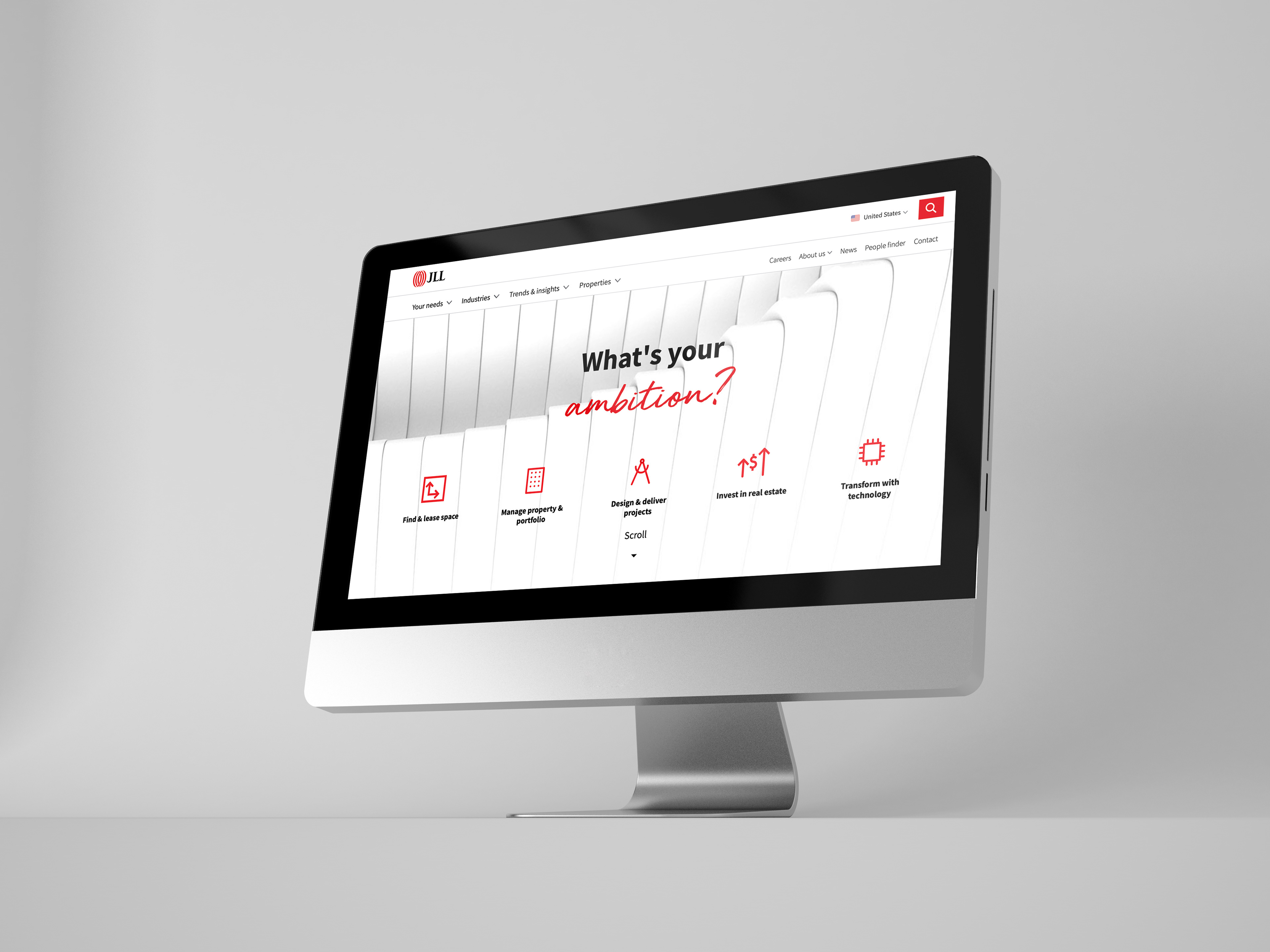
JLL.com site reskin
JLL.com Website Reskin
The rebrand journey wasn’t just aesthetic—it was operational. We rolled out comprehensive brand guidelines, internal toolkits, and training initiatives to ensure consistency and local adaptability across regions. As Creative Director, the challenge was to craft a system that was both globally unified and locally flexible—one that honored the legacy of the brand while boldly redefining its future.

Bespoke Brochures

Whitepapers
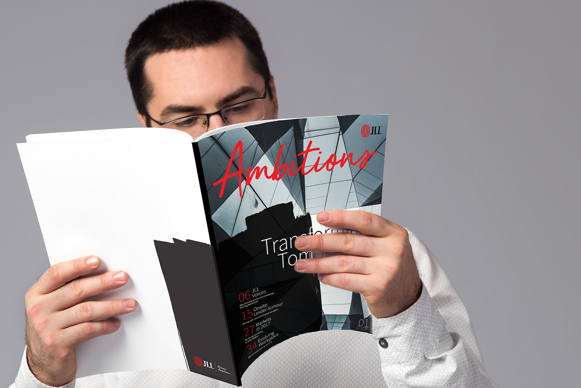
Ambitions Editorial Magazine

Premium Items
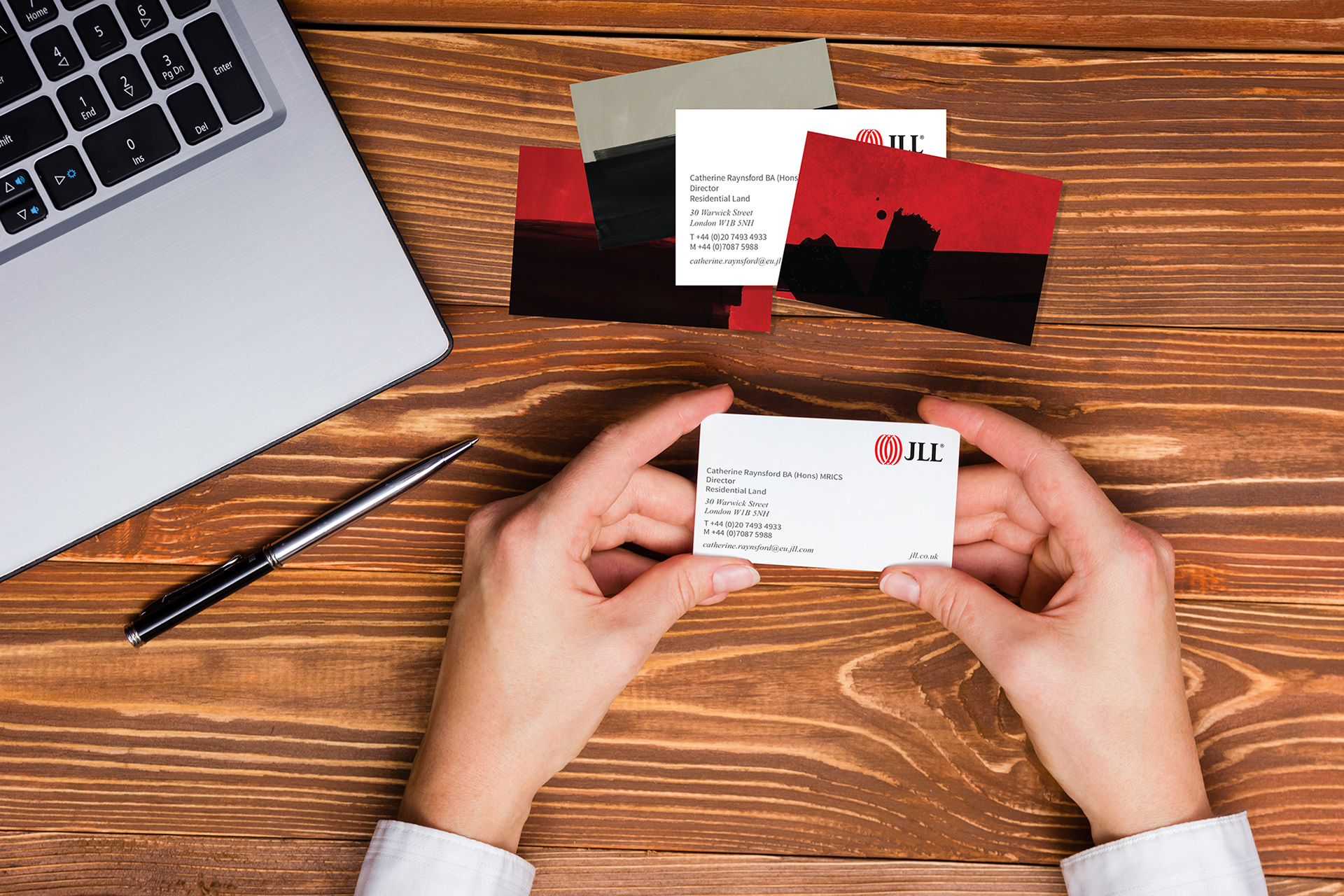
Corporate Stationery

OOH Signage

Landing Pages

Fact sheets
The result was a refreshed JLL: leaner, sharper, and ready to lead in a digitally driven, globally connected world.